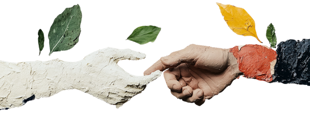
Build Once, Use Everywhere
Your Product Should Feel Like One Thing.
No more mismatched buttons or endless design debates. We build a living system with reusable components, clear rules, and seamless developer handoff — so your team ships faster and cleaner.

Our Design System Process
From audit to living library — structured for long-term use.
Audit
Review existing UI patterns and gaps
Define
Tokens (color, typography, spacing), naming conventions
Build
Core components (buttons, forms, modals)
Document
Usage rules, do’s and don’ts
Deliver
Figma library + developer handoff
What’s Included
A complete, production-ready design system.
Design tokens (color, typography, spacing & more)
Core UI components (buttons, inputs, cards & more)
Component states (hover, active, disabled)
Responsive behavior guidelines
Figma library with auto-layout and variants
Developer documentation (CSS/React mapping)
Maintenance guide for future updates
Real Work. Real Impact.
From unorganised components to systematically designed components in weeks
Businesses who trusted us.
From bootstrapped startups to funded scale-ups — we’re the quiet force behind smart products.
Frequently Asked Questions
Everything you need to know about our design system process, deliverables, and how we work.

Ready to Scale with Consistency?Let’s Build a Design System That Grows With You
Let’s Build a Design System That Grows With You
No more design drift. No more rework. Just a unified, scalable foundation for your product team.
